investmentregulation.ca · August 2026
How I built my CIRE course.
I'm taking the CIRE, the exam you need to pass to move up in financial sales in Canada. What you get to study from is three PDFs. They tell you what's on the exam. They don't teach you any of it.
They start halfway through.
The first thing you read is a sentence like "the IDPC Rules govern Approved Persons in respect of suitability determination." If you already work in the industry, fine. If you don't, that's four things you'd have to look up before the sentence means anything, and the document never tells you any of them.
I set myself a test for whether I'd fixed it: could my eight-year-old brother open the first lesson and follow it? That's why lesson one is "what is investing" and not anything about regulation. By chapter eight, a sentence about who oversees investment dealers reads as obvious instead of as a wall.
What's in it
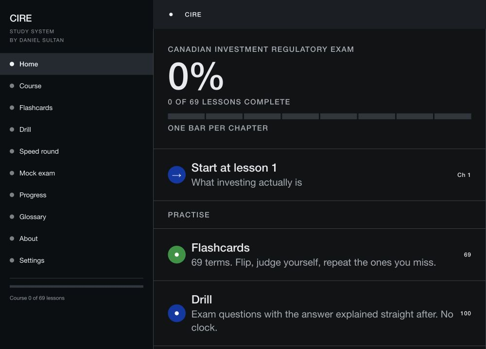
- 69 lessons, in order, each one building on the one before.
- A hundred practice questions, weighted the same way the real exam is.
- Flashcards that show you a card again sooner if you got it wrong.
- A drill mode with no clock, and a separate timed round for when you want the pressure.
- A full mock exam you can jump around in and review afterwards.
- A glossary you can search, a list of everything you've got wrong, and bookmarks.
- Dark mode, and you can do the whole thing from the keyboard.
There's no account and nothing to pay. Your progress is stored in your own browser, so nothing you do on it is sent to me or anyone else.
What changed
It was a quiz that assumed you already understood finance, which is exactly the thing I was annoyed about in the first place. I threw it out.
Then I found the correct answer was the longest option 72% of the time. If a quarter of answers should be right by chance, that means you could pass without reading the questions properly, you'd just pick the longest one. I went back through all 98 questions and evened out the lengths.
The flashcards passed every test I ran and then didn't flip when I tried them on my actual phone. That took a while to work out: the tap was landing on an element that was being rotated in 3D, so the touch never reached the card.
And the definitions were wrong. Not slightly, properly wrong. I rewrote all 69 of them by hand.
How it ended up looking like this
The first design had every generic look you've seen a hundred times. I rebuilt it on the 1970 New York City Transit Authority Graphics Standards Manual instead: one typeface, colour used only for identity, red kept strictly for warnings, no gradients, no drop shadows. A rulebook someone else already thought hard about.